Improving Your Grapher (Teacher's Choice)
I'm not sure what this list is for. Al thinks it may have been addressed. If so, please delete. If not, please say more. --MF
- examining the graph (reporting coordinates)
- zooming in on a section
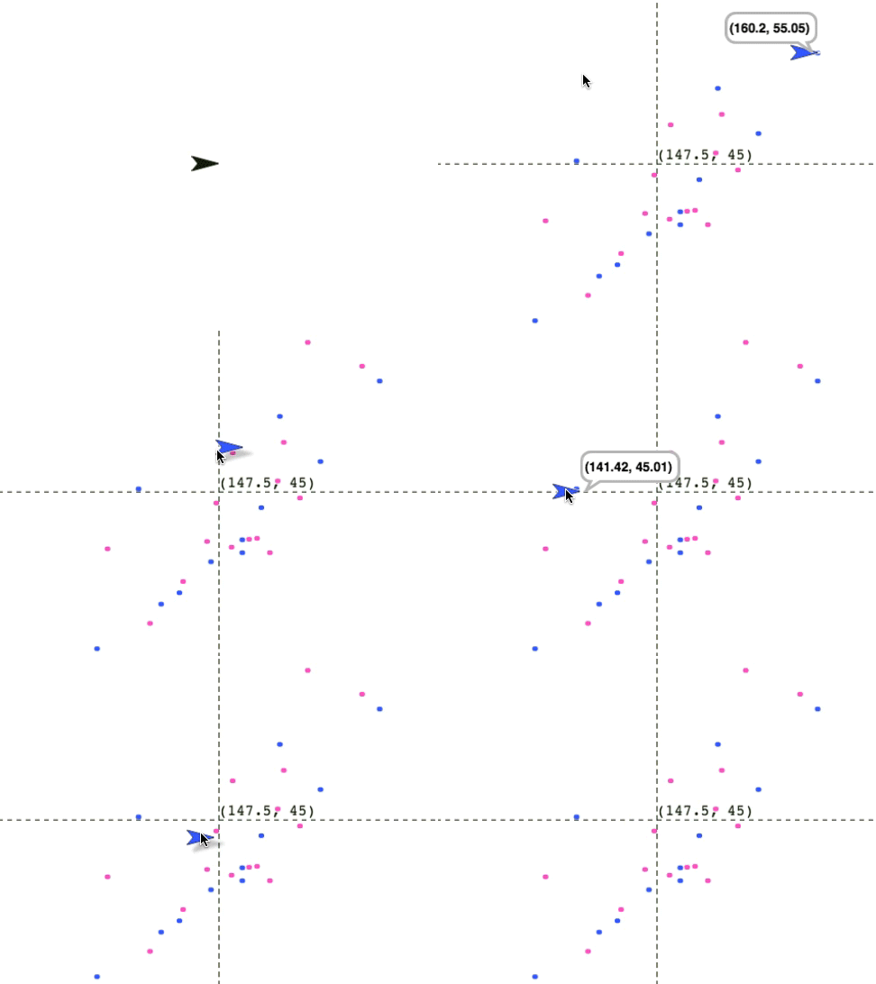
On this page, you'll work with a dataset on a classroom of 27 sixth-graders. You will create a graph of height vs. weight, showing the boys and girls in different colors that also allows you to examine individual datapoints to see their approximate values, like this:

- Load your graphing app from before; it should be saved as "U5L2-GraphingApp."
-
Look in the Variables palette for this dataset on a classroom of 27 sixth-graders:
 . Each data point in this set contains four items:
- age in month

- height in centimeters
- weight in kilograms
- gender
Your graphing app was written to expect only two numbers in each datapoint. Will it even work with this dataset? Try it. What does it do?
-
Create custom blocks that report:
ages—a list containing only the 27 agesheights—only the 27 heightsweights—only the 27 weights
-
You've built averaging blocks before.
Create a block that takes a list of numbers as input and reports the average value.
- Create a block,
female data, using keep, that reports a list containing all the datapoints of only the girls, and another block, male data, that does the same for the boys.
- You now have everything you need to create a graph of height vs. weight, showing the boys and girls in different colors that also allows you to examine individual datapoints to see their approximate values, as shown in the animation above. Build it.
-
 Use the tools you have built to create a few separate graphs: age against height or weight, height against weight, separated or not separated by gender—and also mark the averages in each case. What can you say about this particular class based on the data?
- You probably needed to reset the window scale for some of these graphs. Searching through the data to find the lowest and highest values can be a nuisance. Create tools to do that for you.
- The graph above shows three aspects of each child in the class (height, weight, and gender). Find some suitable way to give some information about the fourth element of the data (age). Pen size is one possibility, but you might find a different way.


 . Each data point in this set contains four items: