Plotting a single point, given its two coordinates, should feel this simple:
Then you could graph a whole list of data points by inventing a block like  that uses
 for each to apply PlotPoint to each point in the list. Depending on the kind of graph you want, you could even connect the dots.
That seems like all you should need. But what if the scale of your data does not fit on the Snap! stage (between -240 and 240 in the x direction and between -180 and 180 in the y direction)? For example, what if you want to plot the popularity of a baby name over time, like this?

The x-values can't be plotted because they are completely off of Snap!'s stage. And the y-values 0, 0.1, 0.2, 0.3, etc., are so close to each other that they would all look the same. We wouldn't see the huge increase in popularity between 1960 and 1980 at all.
set window scale block with the inputs it already has (-2, 4, 30, 300) to see what it does. In addition to drawing on the screen, it sets several variables that your other blocks will need so that they know the intended screen dimensions. 

-y-(stage-coord-for-y).png "go-to-x-(stage-coord-for-x)-y-(stage-coord-for-y)") with those same input numbers. Where does it put the sprite?
with those same input numbers. Where does it put the sprite? .png) and explain the result you get.
and explain the result you get. block with your new script so that when you move the sprite around, it says its graph coordinates wherever it is dropped.
set window scale to (1927, 2014, 0, 0.5) and click it to reset the scale of the screen. Check to see if your sprite says what you expect when you move it around the stage.-xmax-(2014)-ymin-(0)-ymax-(0.5).png)
set window scale to see where it puts the axes and how it represents the "substitutes" for the axes, when the axes can't be shown. Then, change the inputs of set window scale back to (1927, 2014, 0, 0.5). .
.
On the baby name graph for Derek, the point (1971, 0.25) is roughly in the middle of the screen. Check to see if -y(0.25).png) is working as you expect it to.
is working as you expect it to.
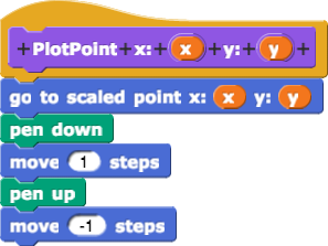
PlotPoint so that it uses go to scaled point instead of plain go to. Check it to make sure it works as you expect it to. to make a dot at every datapoint, but not to connect the points (for now). Apply it to DerekData1927to2015. Your graph won't be connected and won't have labels, and it will fill the whole stage, but it should otherwise look like the graph above.