Visualizing Data
DAT-2.D.2, DAT-2.D.6 bullet 4
Tables, diagrams, text, charts, graphs, and other visual tools help extract, modify, and communicate information from data.
On this page, you will create a visualizations to help you analyze and communicate information from your dataset.
Grouping Data
:
Classifying Data
DAT-2.E.3 classifying only
Classifying data means distributing data into groups based on common characteristics.

- Column A shows all of the vehicle makes (field 14 of each record).
- Column B shows the total number of vehicles of each make.
- Column C contains a list of all the data from cars for the vehicles of that Make (such as all the data for the Acuras or all the data for the Nissans). If you double-click one of the lists in column C, another table will open showing the data for all cars of that make.
The by intervals of input to the group table block should be left empty when, as in this example, the field on which you're grouping is text rather than numbers. Later on this page, you'll see how to use intervals in graphing.
- Open your U5L3-Data-Processing project if it isn't open already.
-
 Determine one question you can answer by grouping your data, and build code to answer it.
Click for example questions for which grouping is helpful.
- How many Toyotas are in the database?
- Which brand in the table has the most models listed?
- How many 2010 Hyundais are in the database? (This requires looking inside one of the lists in column C, so you'd need two
keep functions.)
Pipe may be useful for questions that require looking inside the inner lists of the grouped data (in column C).
Plotting Data
The bar chart function works like the group function, but with special features for numeric data: it allows you to select upper and lower limits of the data; you can have a range of values in one bucket, such as values 6–10, values 11–15, and so on; and it sorts the groups. For example, here is the cars data grouped by city MPG (column 9):
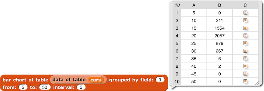
- Now, Column A shows city MPG (field 9 of each record) grouped into intervals of 5 and sorted.
- As before, Column B shows the total number of vehicles within each MPG range (0–5, 6–10, 11–15, etc.)
- As before, Column C contains a list of all the data from cars within that MPG range (such as all the data for the 879 cars that get between 21 and 25 MPG in the city).
The number in column A is the largest value included in each group. If the values aren't all integers, the next group includes anything larger. For example, the group numbered 15 includes values from 10.0001 (or anything more than 10) to exactly 15.
You can plot the data from bar chart to visualize them:

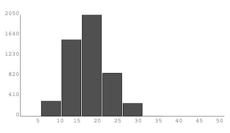
- Research the question of why would you ever use an interval larger than 1.
 Determine one question you can answer by grouping your data, and build code to answer it.
Click for example questions for which grouping is helpful.


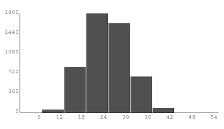
![[same plot bar chart instruction as above, but with grouped by field: (11) and interval: (3)] plot bar chart (bar chart of table (data of table (cars)) grouped by field: (11) from: (5) to: (50) interval: (3)) bars at x: (-200) y: (-100) width: (400) height: (200) [same plot bar chart instruction as above, but with grouped by field: (11) and interval: (3)] plot bar chart (bar chart of table (data of table (cars)) grouped by field: (11) from: (5) to: (50) interval: (3)) bars at x: (-200) y: (-100) width: (400) height: (200)](/bjc-r/img/5-algorithms/interval3.png)
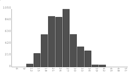
![[same plot bar chart instruction as above, but with grouped by field: (11) and interval: (6)] plot bar chart (bar chart of table (data of table (cars)) grouped by field: (11) from: (5) to: (50) interval: (6)) bars at x: (-200) y: (-100) width: (400) height: (200) [same plot bar chart instruction as above, but with grouped by field: (11) and interval: (6)] plot bar chart (bar chart of table (data of table (cars)) grouped by field: (11) from: (5) to: (50) interval: (6)) bars at x: (-200) y: (-100) width: (400) height: (200)](/bjc-r/img/5-algorithms/interval6.png)
