ST EK List:
1.2.3B Computation facilitates the creation and modification of computational artifacts with enhanced detail and precision.
3.1.1B Digital information can be filtered and cleaned by using computers to process information.
3.1.1D Insight and knowledge can be obtained from translating and transforming digitally represented information.
3.1.1E Patterns can emerge when data is transformed using computational tools.
3.1.2A Collaboration is an important part of solving data driven problems.
3.1.2B Collaboration facilitates solving computational problems by applying multiple perspectives, experiences, and skill sets.
3.1.2C Communication between participants working on data driven problems gives rise to enhanced insights and knowledge.
3.1.2D Collaboration in developing hypotheses and questions, and in testing hypotheses and answering questions, about data helps participants gain insight and knowledge.
3.1.2E Collaborating face-to-face and using online collaborative tools can facilitate processing information to gain insight and knowledge.
3.1.2F Investigating large data sets collaboratively can lead to insight and knowledge not obtained when working alone.
3.1.3A Visualization tools and software can communicate information about data.
3.1.3B Tables, diagrams, and textual displays can be used in communicating insight and knowledge gained from data.
3.1.3D Transforming information can be effective in communicating knowledge gained from data.
5.1.2B Developing correct program components and then combining them helps in creating correct programs.
5.1.2C Incrementally adding tested program segments to correct, working programs helps create large correct programs.
Purpose: Students will learn about basics of data visualization and create a general purpose tool for displaying bar graphs which they can use even in their other classes.
Why here: This is a lab about data visualization. Bar graphs are fundamental tools in data visualization.
Why now: Students are already familiar with ideas of abstraction and general purpose blocks from U1,2. Now they will put those skills into good use in the context of data visualization, breaking a difficult task into smaller manageable parts and creating a versatile computational tool. They will have basic exposure to scaling so when they are given scaling tools in the next pages (Graphing App) it won't feel completely like magic.

Some feedback from Al that may not have been integrated but should be before further revisions to this page. --MF, 6/29/17

Creating Bar Graphs

In this project, you will create a general purpose data visualization tool that can generate bar graphs for a variety of data sets. You will practice using abstraction and the higher order function map.
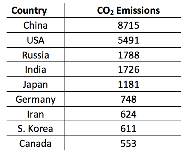
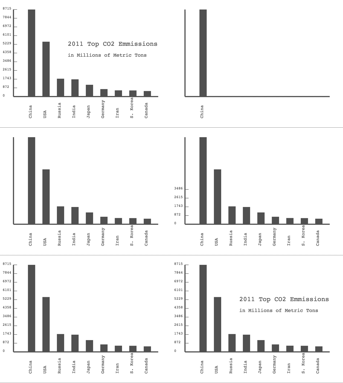
Table of CO2 Emissions by Countrybar graph of 2011 Top CO2 Emissions

  1. Talk with Your Partner Technology has come at the cost of environmental pollution around the world. In collaboration with your partner, examine the data table given on this link.
    1. What countries have the highest Carbon Dioxide (CO2) emissions?
    2. What countries have the highest CO2 emissions per capita (per person)?
    3. Which of these measures do you think is a better indicator of a country's contribution to global environmental pollution?
  2. You can gain knowledge and insights by talking to others (in person or online) as you form questions and hypotheses about data.
  3. Click here to load this file. Then save it to your Snap! account.
    This file contains
    • A constructor of a new ADT (Abstract Data Type) called data-record with two fields label and value.
      data-record, label:(China) value:(8715) reporting {China, 8715}
    • Two selectors for the new ADT, to extract specific data from a data-record input.
      label from data-record:(data-record, label:(China) value:(8715)) reporting China
      value from data-record:(data-record, label:(China) value:(8715)) reporting 8715
    • A max of list reporter that finds the largest element of a list.
      max of list (list{1,7,-3,4}) reporting 7
    Explore the blocks already written for you and understand how they work.
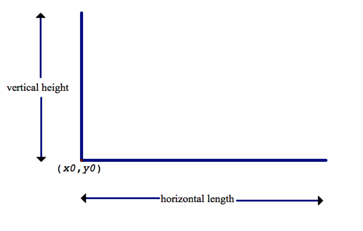
  4. Develop code for the draw axes block. It should draw the horizontal and vertical axes based on the given stage coordinates of the origin x0, y0 and the given length, height information.
    draw axes, x0:(-200) y0:(-90) horizontal length:(400) vertical height:(240)
    This diagram may help you understand how the given information will determine the horizontal and vertical axes. As you will be graphing only positive values, the axes should meet in the lower left corner as shown in the diagram. There should not be any labels or tick marks at this point. The markings in the diagram are shown for clarity.
    x-y axes
    In the draw axes block also make sure that the coordinates of the origin is stored in global variables x-origin, y-origin. In the upcoming steps of this project, other blocks will need this information to properly allign the bars and labels .
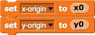
    Variables x-origin, y-origin set(x-origin) to (x0), set(y-origin) to (y0)
    You can import the basic label block in your new projects via the "Import tools" option of the File menu:
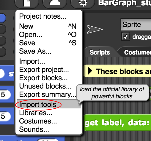
    Import tools option
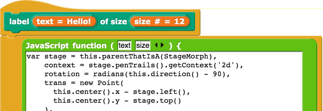
  5. Explore the basic label block included in the starter project. Try changing the location and direction of the drawing sprite.
    label(Hello!) of size(12)

    Note that the label block does not need to have pen down in order to do its writing. Having pen down with the label block may cause some undesired effects.

    You're not required to look inside the label block, but if you do, you'll see something unfamiliar.

    Label with JavaScript
    Snap!, like pretty much everything that runs in a browser, is written in a programming language called JavaScript. The label block is implemented using a Snap! JavaScript function block that allows advanced users to extend Snap! by adding new blocks written in JavaScript.

    You don't need to know how the label block works to be able to use it. By hiding its inner complexity from its users, the label block is a perfect example of abstraction.
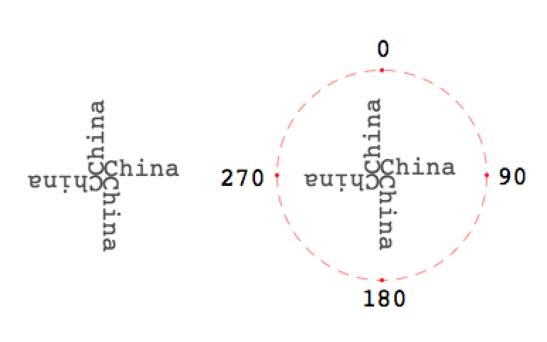
  6. Use the basic label block to develop code for the more elaborate label block that will place a label with the inputted specifications (text, size and direction.)

    label, text:(China) size:(18) direction:(0)China label

    Note that the orientation directions should follow Snap! ’s convention for directions (0o up, 90o right, 180o down, 270o left). Test your new label with the four directions.
    China label in 4 directions
  7. Develop code for the draw bar block. It should draw a vertical bar (a line with the given width and height) straight up from the current location with a label placed underneath the bar.
    draw bar, label:(Germany) label size:(12) width:(25) height:(120) Germany bar
    You may wish to review your earlier Brick Wall project to remind yourself how to draw bars with a pen of a given width. You don't need to import set flat line ends to block from that project but make sure that you have "Flat line ends" selected from the Settings menu to draw rectangular bars. You can see below the difference in two types of lines drawn.
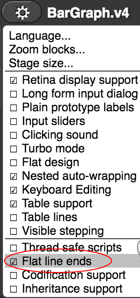
    Flat line ends option Flat line bar Rounded line bar
  8. Develop code for the draw bars block, which should draw a series of labelled bars of the desired width and an appropriate height that start on the left and continue to the right. In order to properly level the bars and the labels you may need to refer to the global variables x-origin, y-origin.
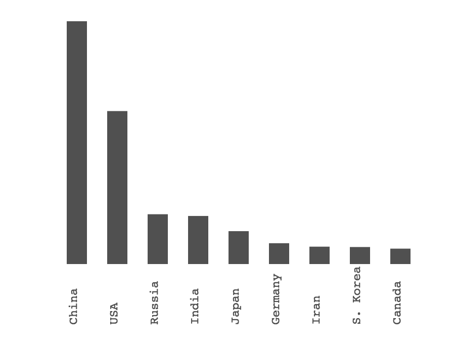
    draw bars, bar width:(20) max bar height:(240) data:(CO2 Emissions Data) Country bars
  9. Note that given a maximum bar height, the heights of all the bars can be computed as a fraction of this maximum bar height. Using the following proportion, you can derive each country's bar height: \frac{\text{country bar height}}{\text{max bar height}} = \frac{\text{country data value}}{\text{max data value}} For example, if maximum bar height=240 and you want to find how tall the bar for USA should be, you first find the largest value in the data set which is 8715 (from China) and do the following computation
    {\text{USA bar height}} = {\text{max bar height .}}\frac{\text{USA data value}}{\text{max data value}} = {\text{240 .}}\frac{\text{5491}}{\text{8715}}\approx {\text{151}}
    While finding the maximum of the data values, first you need to get a list of values and then apply the max of list block. The following block which uses the selector value from data-record will extract a list of values from the given data list.
    map(value from data-record()) over (data list)
  10. Develop code for the label vertical axis block so that it labels the vertical axis based on the specified inputs. For simplicity, you can assume that the labels will always split the vertical axis into 10 equal parts (using 11 tick marks) like this:
    label vertical axis, vertical height:(240) data:(CO2 Emissions Data) y-axis labels
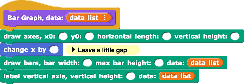
  11. Now you are ready to put everything together and develop code for the Bar Graph drawing block for a given data list input. Fill in the blanks.
    You are allowed to use any other blocks as you need in the definition of Bar Graph.
    Bar Graph, data:(data list){draw axes, x0:() y0:() horizontal length:() vertical length:(); change x by (); draw bars, bar width:() max bar height:() data:(data list); label vertical axis, vertical height:() data:(data list)}
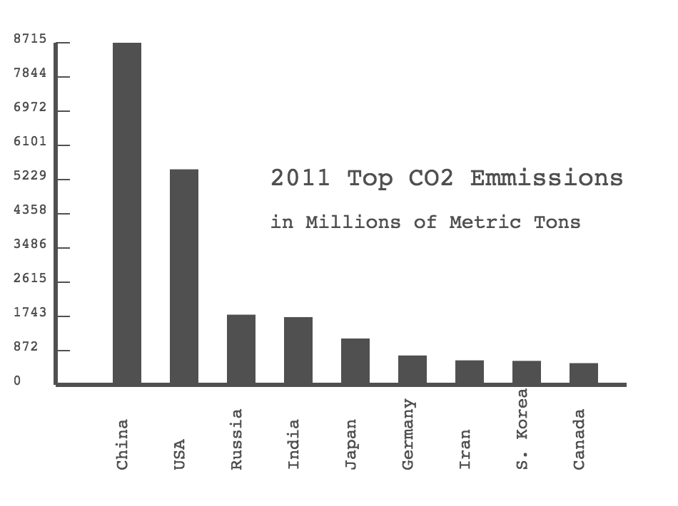
  12. When everything is done, the following code, with a few extra labels for the graph title, should produce a bar graph as shown below:
    Bar Graph, data:(CO2 Emissions Data)
    Please note that the lowest value on the vertical axis must be zero for this bar graph to be a legitimate data visualization. If, for example, you had started the vertical axis at 5000, it would look like China is a vastly worse polluter than the USA.

    In general, be very skeptical of graphs presented to you that do not start at zero.
    Bar Graph of CO2 Emissions
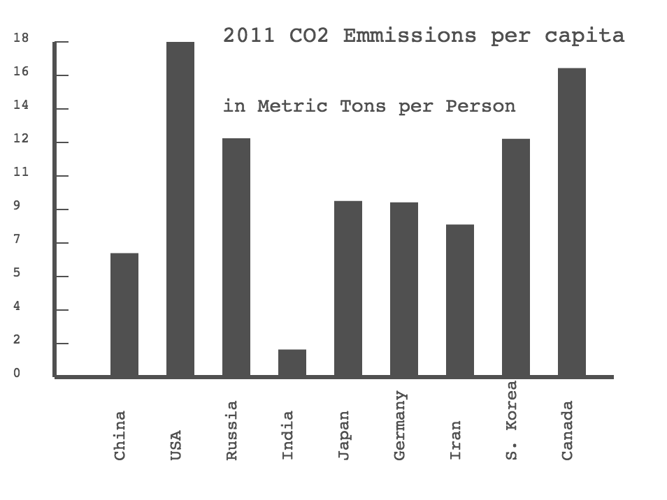
  13. Your coding should be general enough to accommodate a new set of data (also included in your starter file):
    Bar Graph, data:(CO2 Emissions per capita Data)
    Bar Graph CO2 Emissions per capita
  14. Note: "per capita" means "per person". So, for example for China, the total CO2 emissions was divided by the population:
    \frac{\text{8715 Million metric tons}}{\text{1.337 Billion persons}} = {\text{6.52 metric tons per person}} These values are already given to you in the starter file as CO2 Emissions per capita Data.
    Talk with Your Partner
  15. In collaboration with your partner, compare the two bar graphs. What insights does each graph provide about CO2 emissions? Is one better than the other?
  16. Now Is a Good Time to Save
  1. Data Processing: Look at the Variables palette to locate the Country-GDP-Population Data block. When you examine its contents you will notice that it is a list of lists containing data on the GDP (Gross Domestic Product) and population size for each of the countries you studied in this project. Process the data so you can create a bar graph for the GDP per capita of each country.
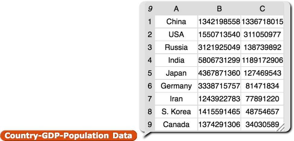
    Country-GDP-Population Data

    Click here for a on how to process data quickly using the higher order function map.
    These blocks may help:
    data-record, label:() value:(); ()/(); item (1) of (); item (2) of (); item (3) of (); map() over (Country-GDP-Population Data)
  2. Now collect some data in your class or from the internet on a topic you care about that would lend itself to visualization with a bar graph. Use your Snap! program to visualize your data. Share your work with your classmates.
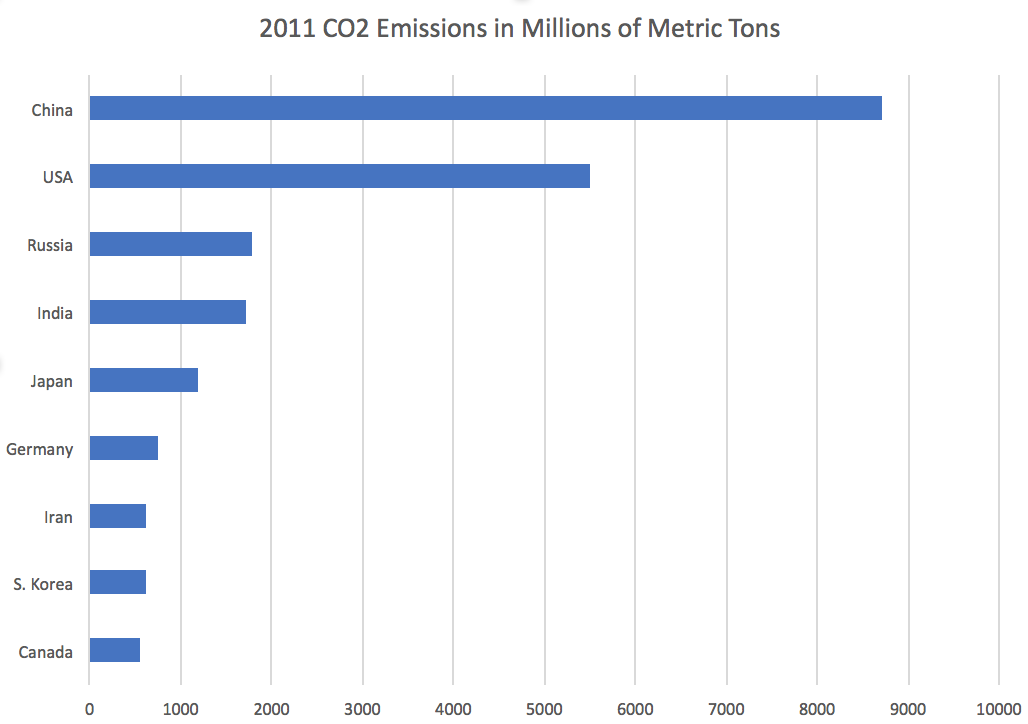
  1. Sometimes it is more convenient to present your bar graph with horizontal bars instead of vertical ones. Modify your code so that it takes an input indicating which type of bar graph (horizontal or vertical) is to be generated.
    Horizontal Bar Graph
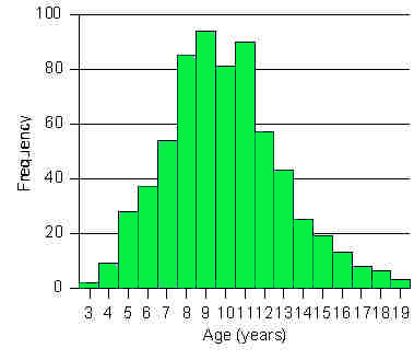
  2. Histograms display numerical data grouped into ranges (called bins) and plotted as bars. For example, the histogram below shows the number of students in each age group at a summer camp. Learn about histograms and create a data visualization tool in Snap! for displaying histograms.
    Histogram